A first-of-its-kind AI-powered remote-patient monitoring system designed to remotely monitor code-red trauma patients en-route to the hospital.

Introduction
The London Air Ambulance delivers an advanced trauma team to critically injured patients.
London’s Air Ambulance required a digital solution to standardize communication between en-route paramedic teams and hospital trauma bays, replacing a primarily verbal system to enable remote patient monitoring during transit.
role
Led research, strategy, and early-stage prototyping to define concepts and shape the product direction alongside my team.
Client
London Air Ambulance (NHS)
in coop with
Floda31, Blizzard Institute, Royal Mary Hospital, Foundation 5
Project
Masters Project (Hogeschool van Amsterdam)
Team
Sjoerd Simmerman, Pin Chun Lin, Farzaneh Salehi
year
2023

The first 60 minutes after a traumatic injury is the golden window that can determine a patient’s life or death.
When a London Air Ambulance is dispatched to a trauma scene, the treatment starts immediately as soon as the injuries are identified and diagnosed. The helicopter emergency medical service (HEMS) team do their best to control and stabilize the patient on-scene and en-route until they arrive to the hospital trauma bay where they can recieve more complex treatments and surgeries.
However, the hospital trauma bay team often know very little information about the situation, events, and interventions that occur during and after the trauma. Upon arrival, a 30-second verbal handover from the paramedics to the trauma bay team takes place as they debrief them of the essential information. Soon after, the trauma bay team take over to re-examine and evaluate the patient once more, creating a redundant process.
research + strategy
1.
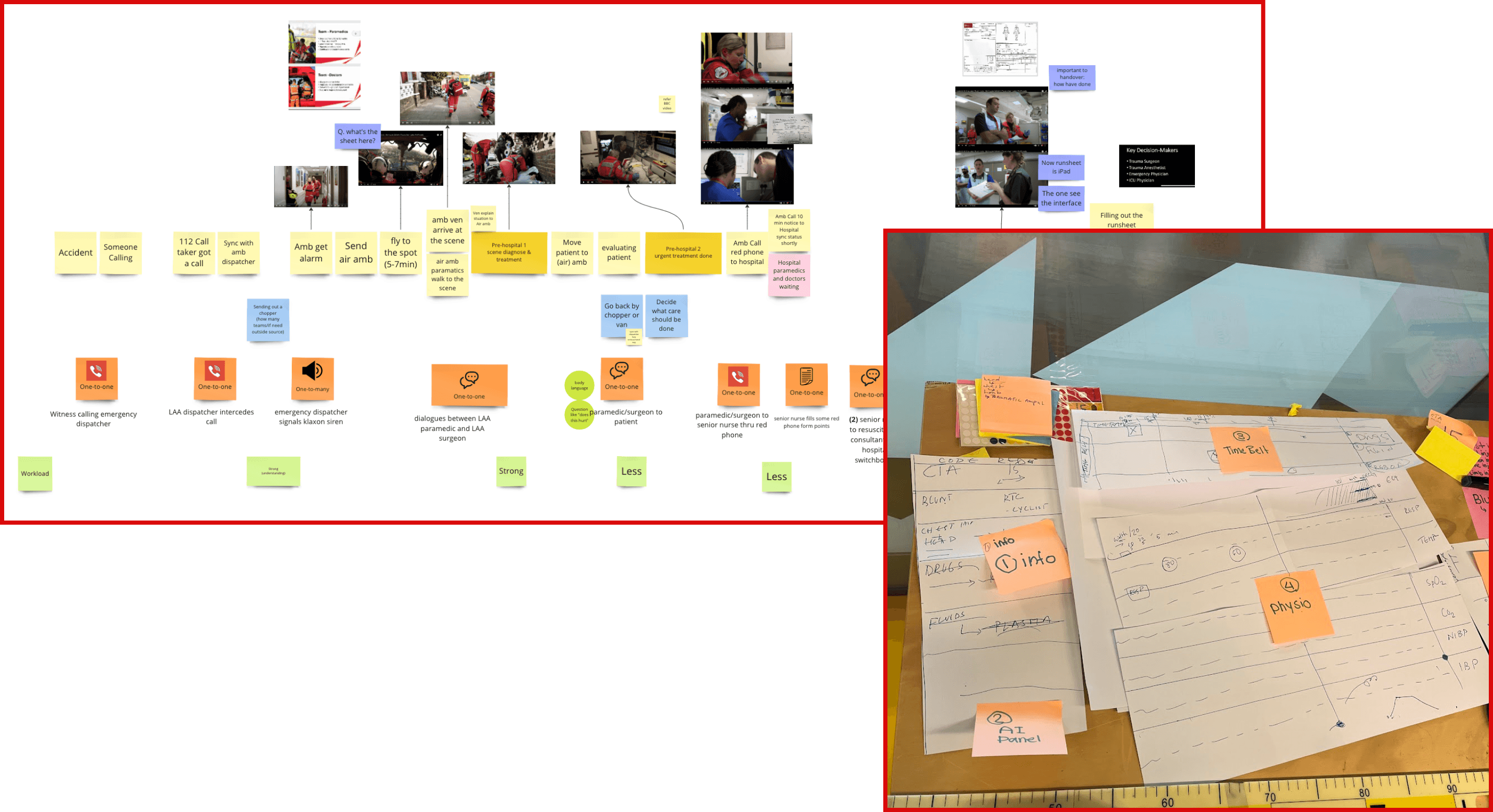
Modes, mediums, and styles of communication between the medical teams in emergency procedures were documented.
2.
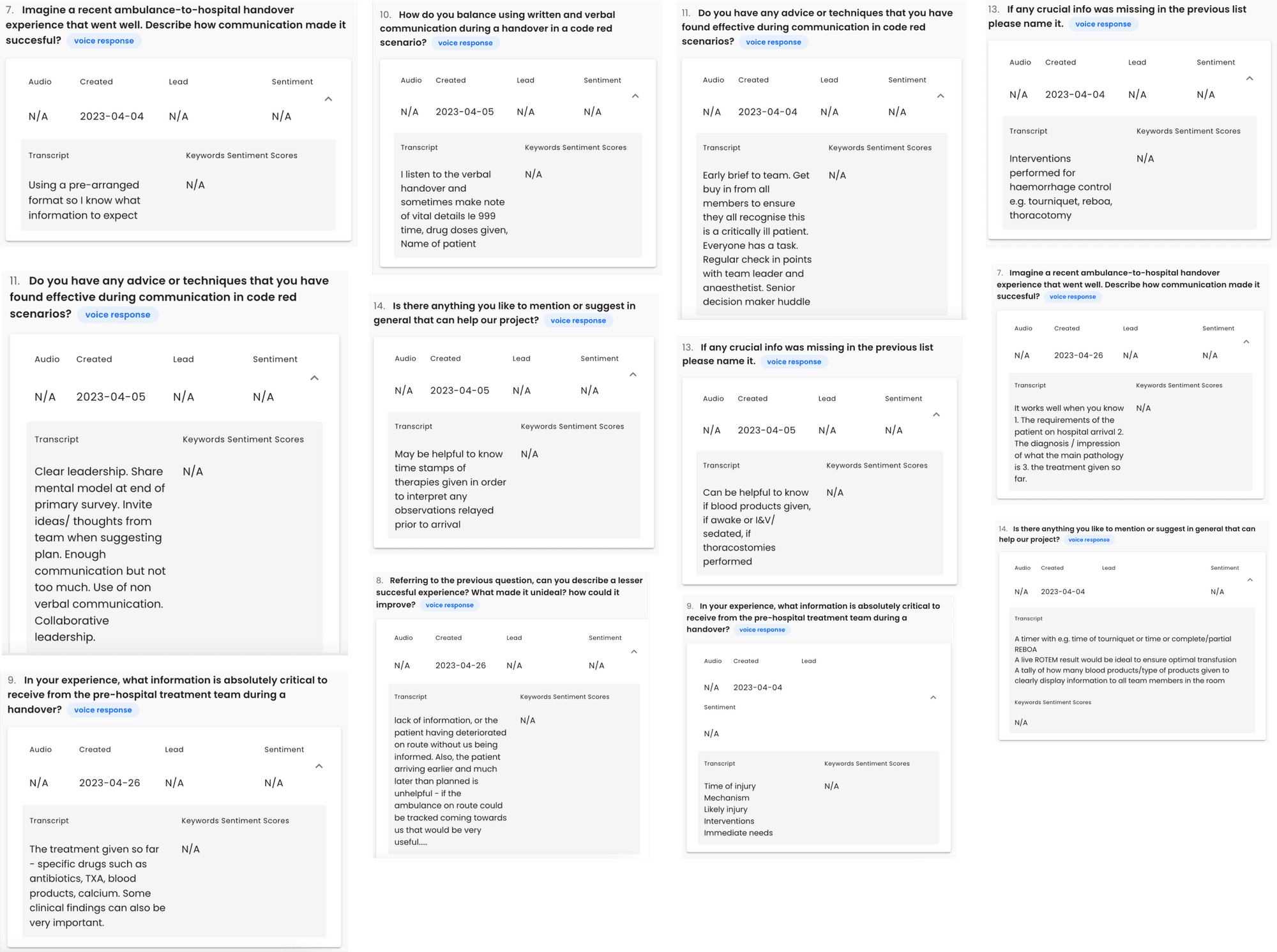
Voice-powered surveys gave us insights to many problems faced by medical personnel in the trauma bay.
3.
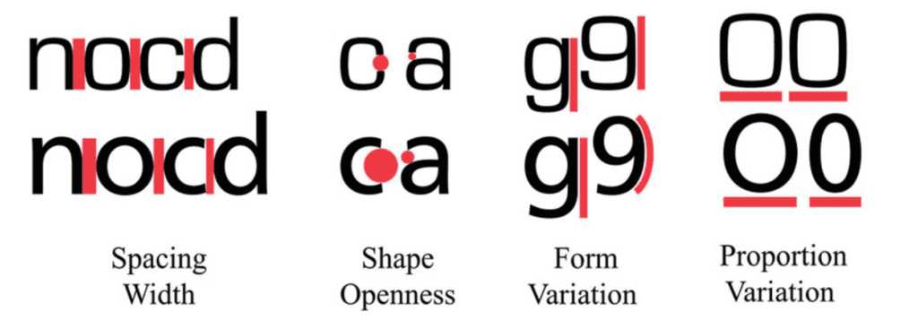
Desk research helped us establish design standards for high-stress medical environments to ensure the interface is highly scannable and easy to be read at a glance.
Data visualization
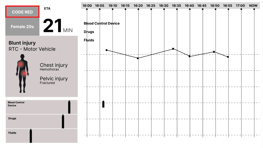
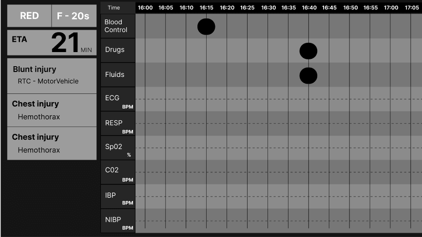
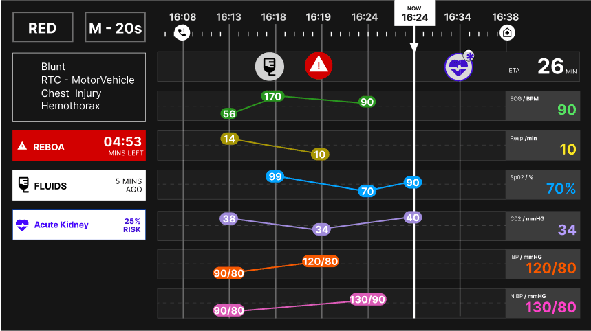
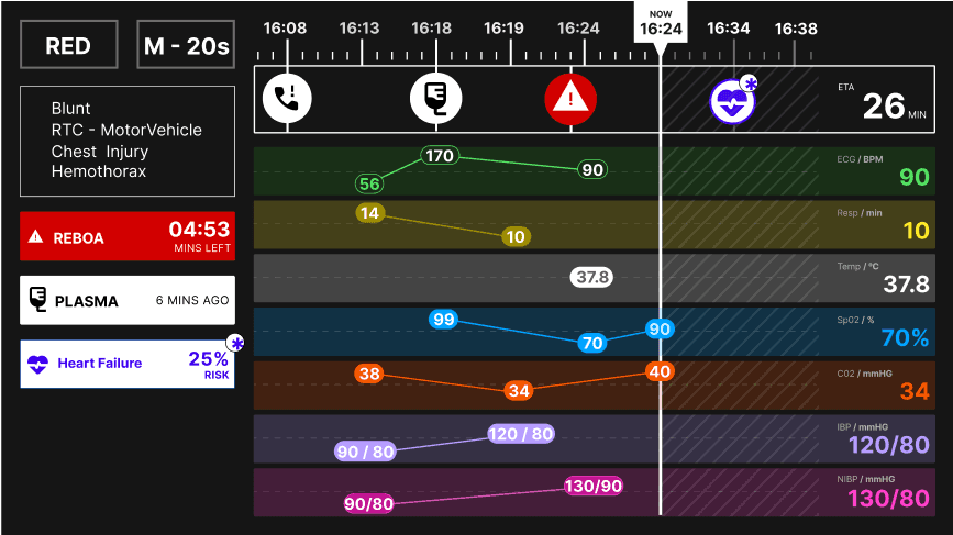
Our research insights led to the creation of a trauma bay interface that utilizes a chronological timeline to display critical patient data clearly.
Alongside the insights, we developed these pillars to help guide our innovation approach without becoming too ambitious.

Co-existence
Designing a system to co-exist with the current process in place to compliment rather than replace.

Standardization
Displaying data with the medical industry’s current visual standards and conventions.

Accessibility
Designing with an understanding of cognitive load, and glance-based legibility.
1.
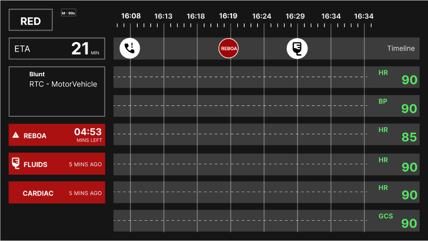
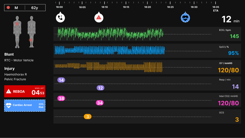
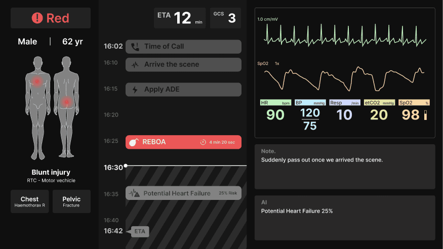
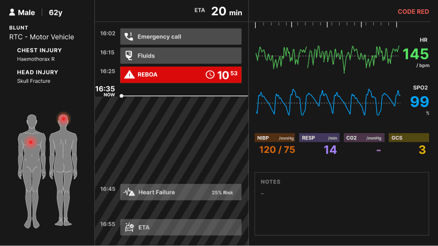
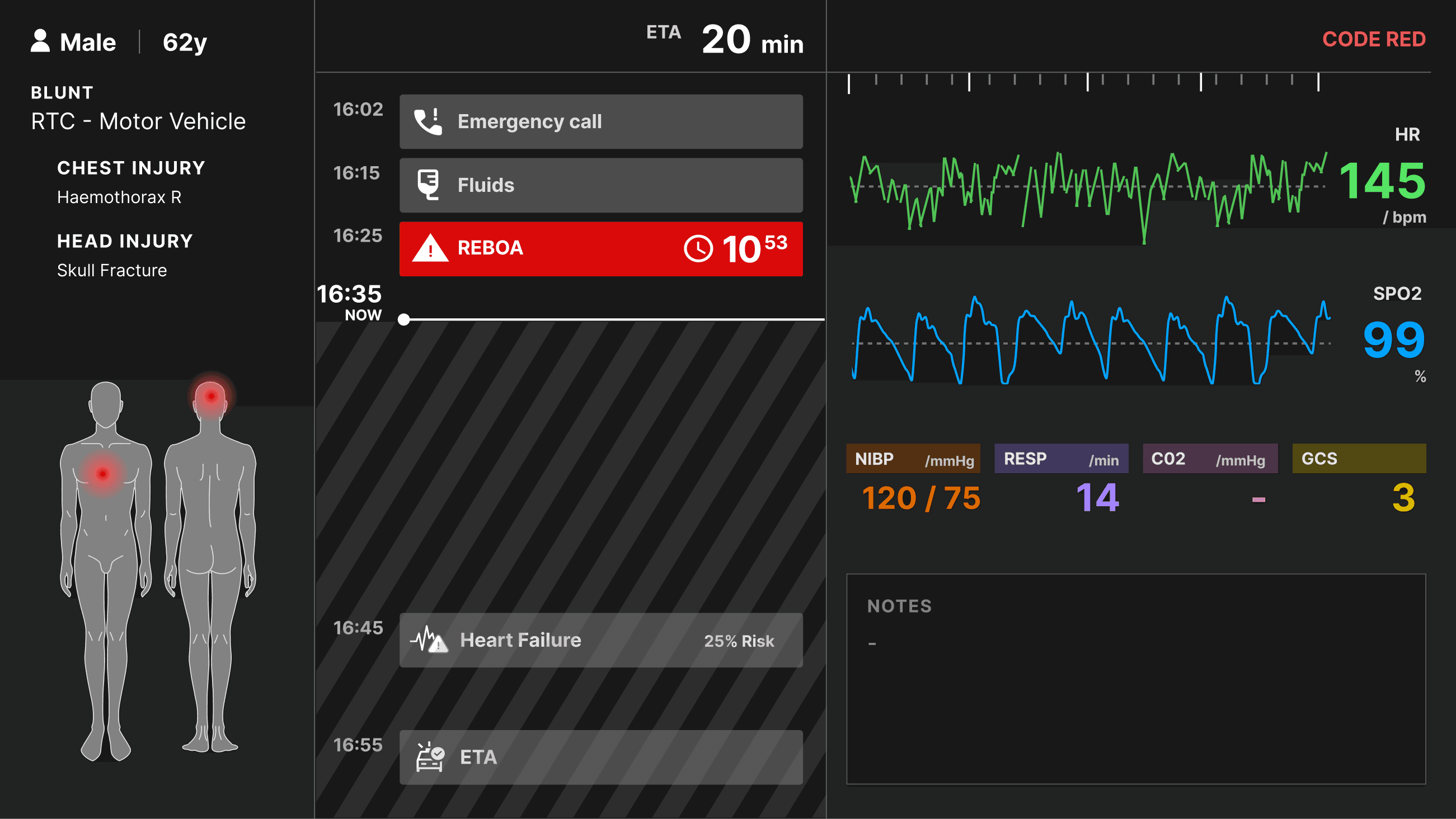
The “time-belt” idea was a concept I came up with during paper-prototyping when we explored the idea of noting down events and interventions performed by the paramedics team. I iterated on the concept by exploring different placements of panels, interventions, and data visualizations. The idea was inspired by having a linear story start-to-finish and an AI- forecasted future.
2.

Medical personnel informed us that historical data is important to track the patient across time. However, the current live trending data is more important as it displays the patient’s actual state in the current time.
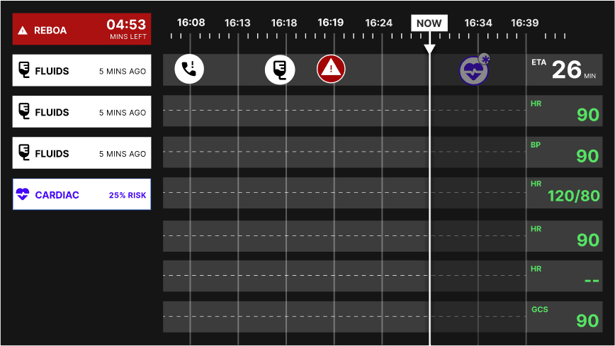
The Accordion Concept aimed to display both at the same time by zooming in towards the last 7-9 seconds documented. I named it “accordion concept” as it aimed to expand the perception of time, then shrink again.
After testing this concept in comparison to the other concepts, it did not prove to be successful as it was too unfamiliar and too complex to follow in an urgent use case scenario. It was not properly percieved.
3.
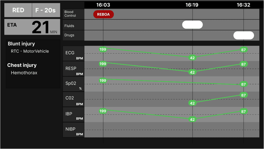
Pin Chun, my teammate, came up with the idea of separating patient interventions and physiologies, instead of having one time axis with everything noted down.
In this way, we have a list of past interventions done, the current time-marker, and the predicted future through the AI algorithm.
It proved to be the best decision when we tested it alongside the Accordion concept.
Data Entry
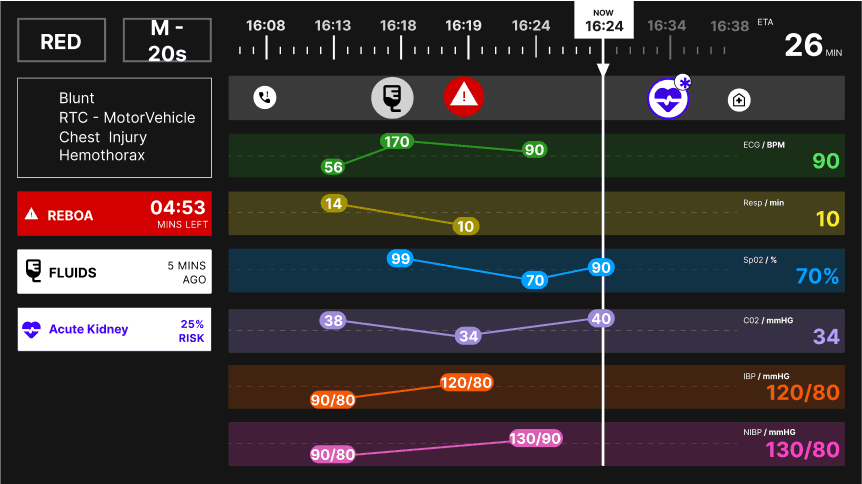
We designed the panel on the right with a live-stream visualization of the patient’s data across a 5-second time scale.
The patient’s ECG, oxygen saturation, and non-invasive blood pressure, are livestreamed through the ZOLL® X Series® monitor/defibrillator that is used by the HEMS team on-scene and en-route to the hospital. The monitor allows data entry in the form of interventions that update the screen’s intervention panel with respective timestamps.
With the assistance of the LAA dispatcher and senior hospital nurse, they can access the screen’s backend system to update manual data entries if needed, such as respiratory rate, C02 saturation, and the Glasgow coma scale. The visualization of the data graph was designed according to conventional patient monitoring systems.
4.
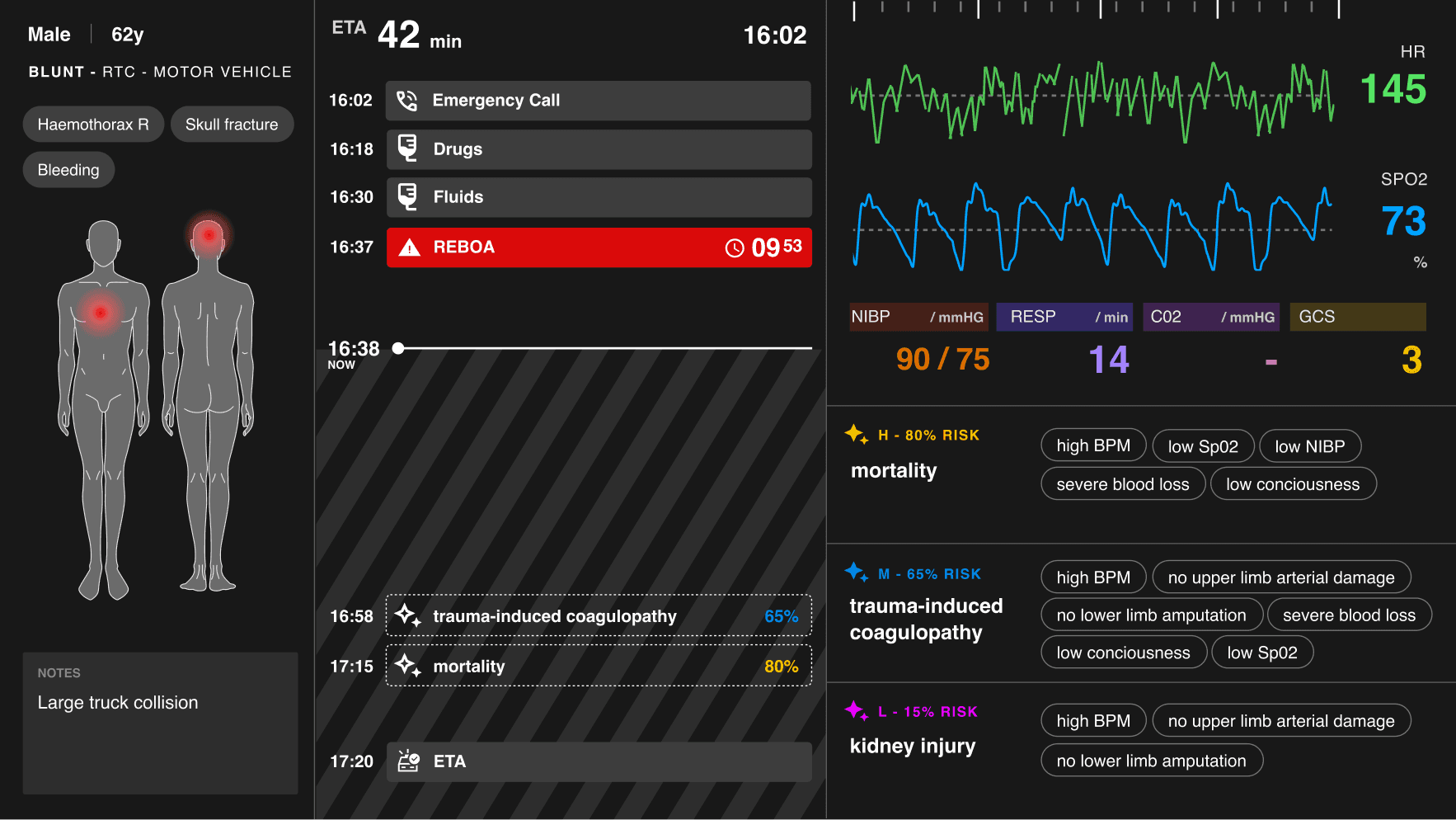
I included a panel with a list of symptoms in tags to explain the AI predictions. The symptoms aim to create rationale to why the AI chose the particular prediction it did. It also aims to build a form of trust with the trauma bay team. People trust what they understand more of.
However, after testing this concept, feedback indicated that the symptoms were too small to read and are redundant. It didn’t make sense to read in a fast urgent scenario.
perception of AI forecasting
AI in healthcare is heavily biased towards eurocentric machine learning data, which can be catastrophic in healthcare.
Explainable AI aims to change this.
It aims to integrate human judgement within the machine learning model in order to remove biases or prejudices, which could be catastrophic in the realm of healthcare.
Final results
Instead of the symptom tags, I opted for a chart that visualizes risk analysis for AI predictions. In this way, the medical team can visibly see the risk predictions in proximity to the events and physiology.
This project was featured in Amsterdam University of Applied Sciences and Foundation 5.