A fully-fledged and responsive portfolio website designed and developed with project pages, engaging interactions, blog and archive system.

Introduction
40MUSTAQEL is an independent design studio based in Cairo with an interchangeable + bilingual identity.
40MUSTAQEL focus on cultural graphic design within the Arab SWANA region. Their identity and work is experimental and have a heavy emphasis on editorial and typographical elements for both Latin and Arabic design work. They wanted a website to match their identity and experimental approach.
role
Translated the brand identity into a cohesive digital experience, designing the full website and bringing it to life through front-end development.
Client
40Mustaqel
Project
Freelance
year
2020-2021
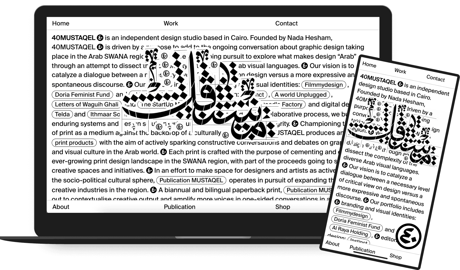
GRID
I incorporated their visual identity by experimenting with a limited grid-range of 1 - 3 columns.
I was inspired by the studio’s visual language and their editorial posters and branding identities. By limiting the website grid range to 3 columns instead of a traditional 12, I created a unique visual system that highlights the typographical elements of their identity.
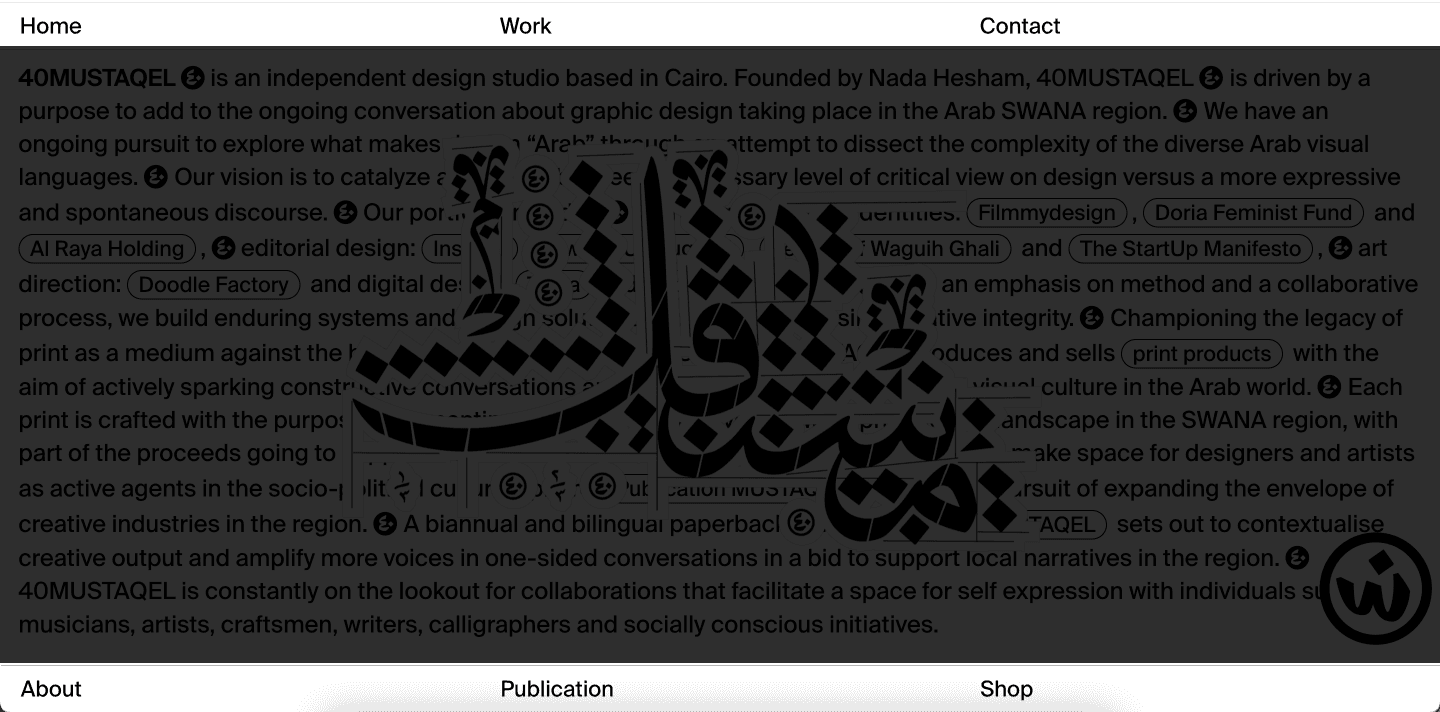
The site architecture was visualized through a minimal 3-column header and footer fixed to the top and bottom of the viewport.

1-column (home page)
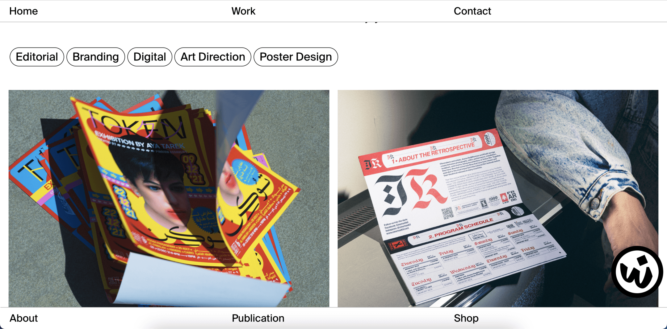
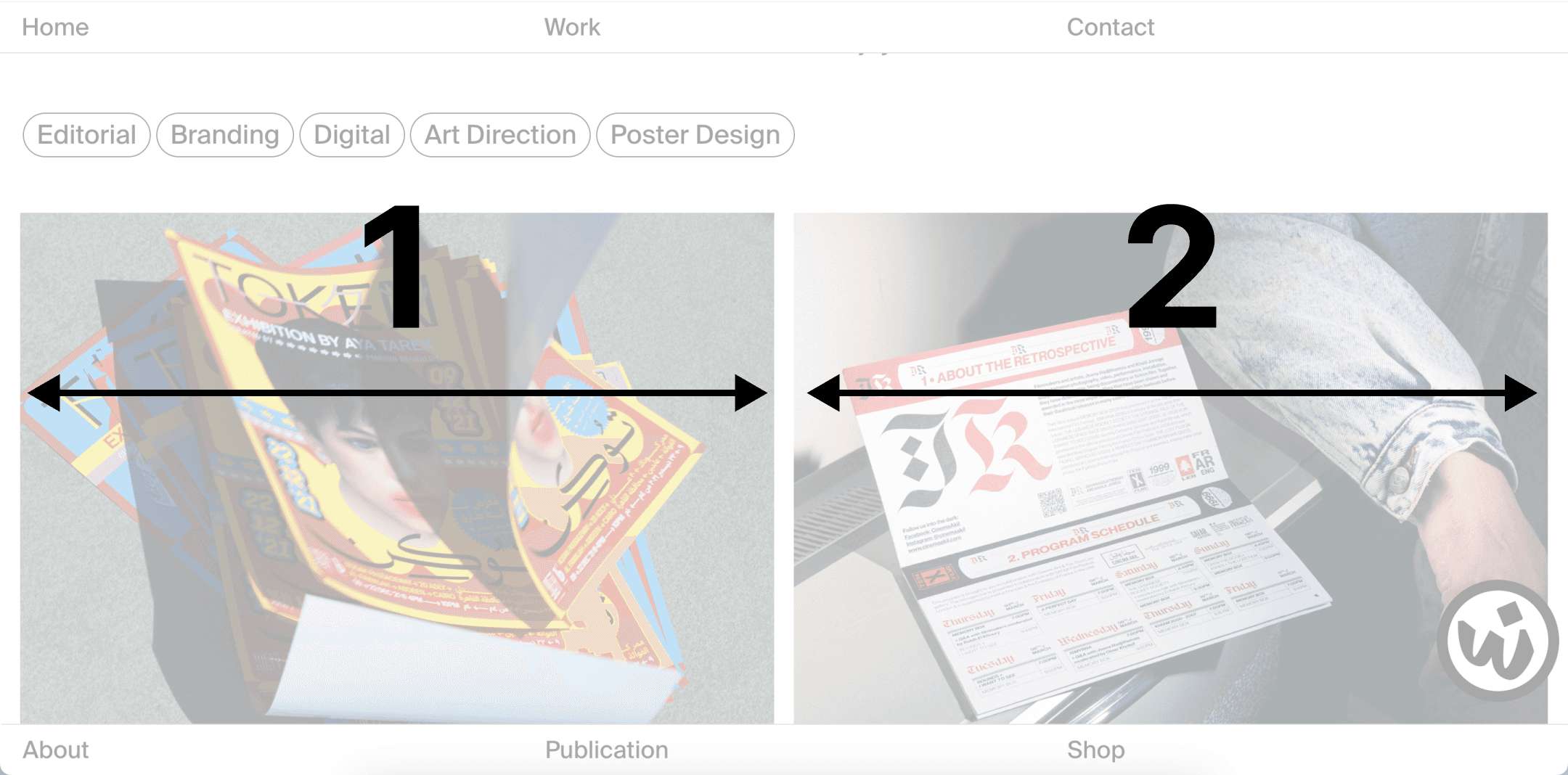
2-column (work page)
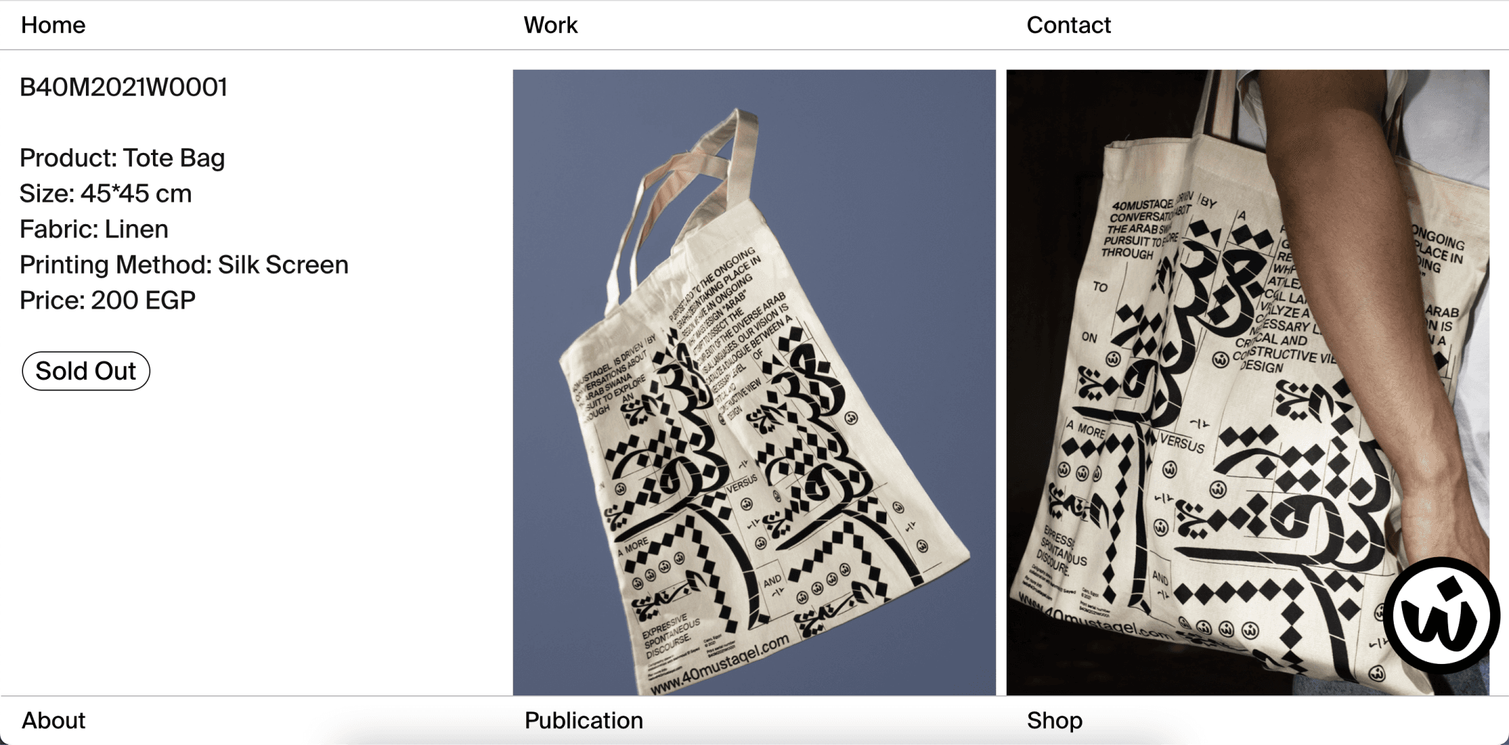
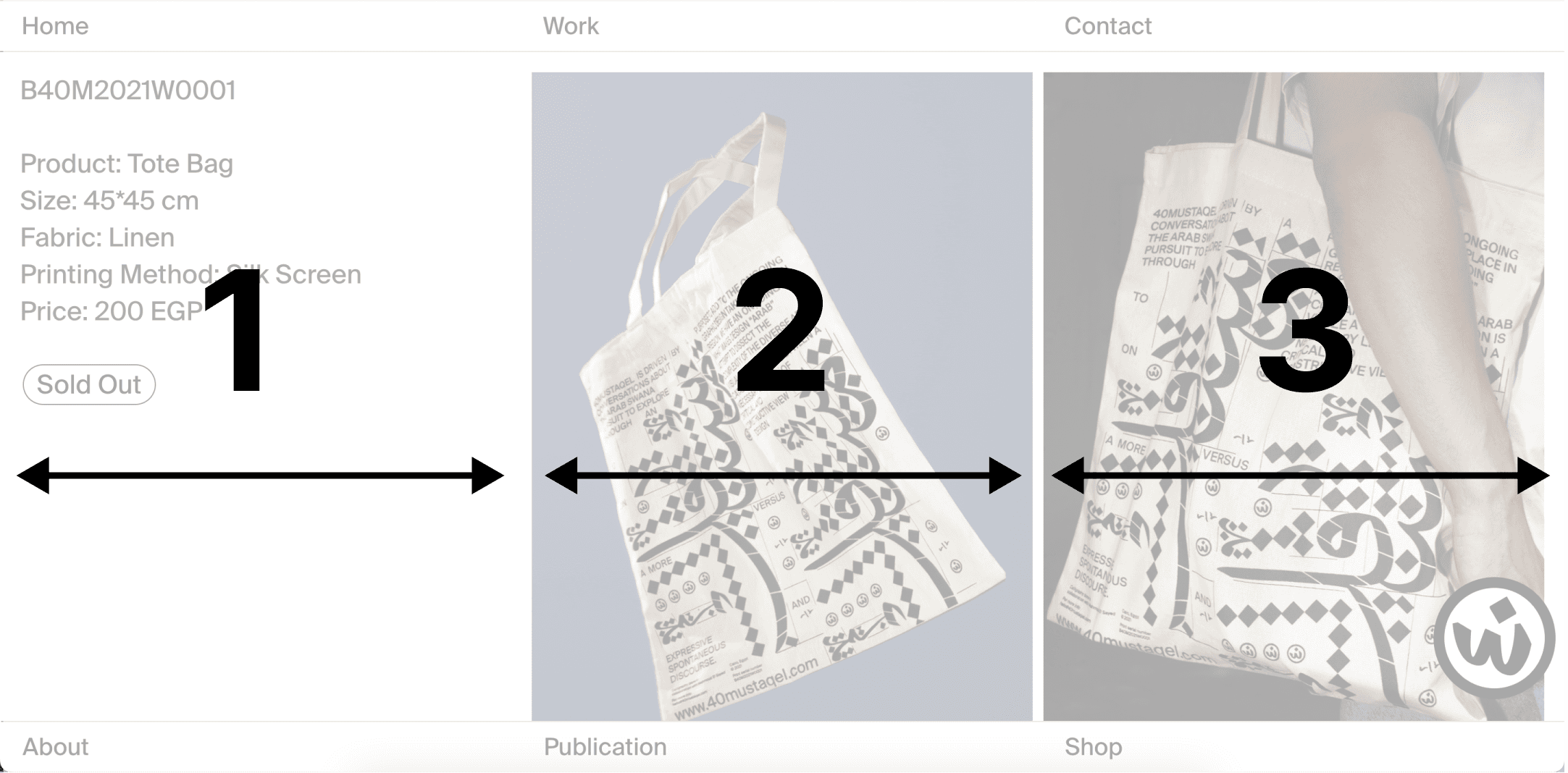
3-column (shop page)
typogrraphy
One-size of one typeface was used, with the exception of one serif for headlines. I relied on different visual forms such as borders, font weights, and text decoration to create framing and visual hierarchy.
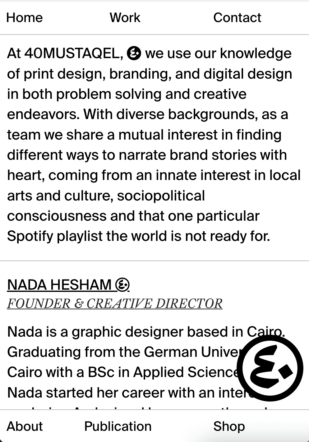
About page
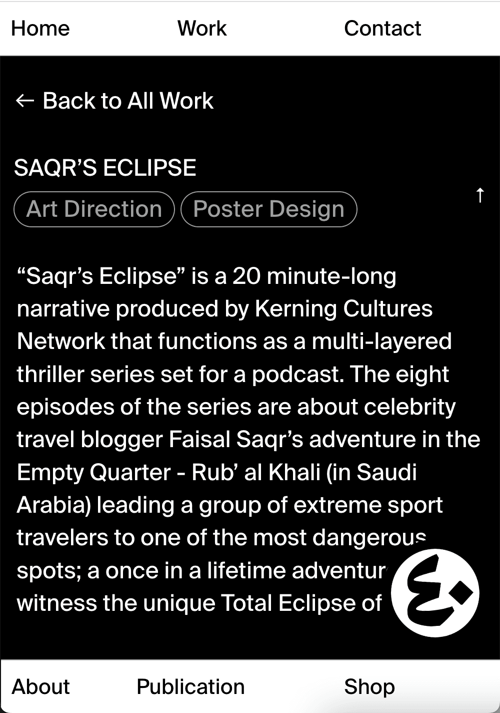
Project page
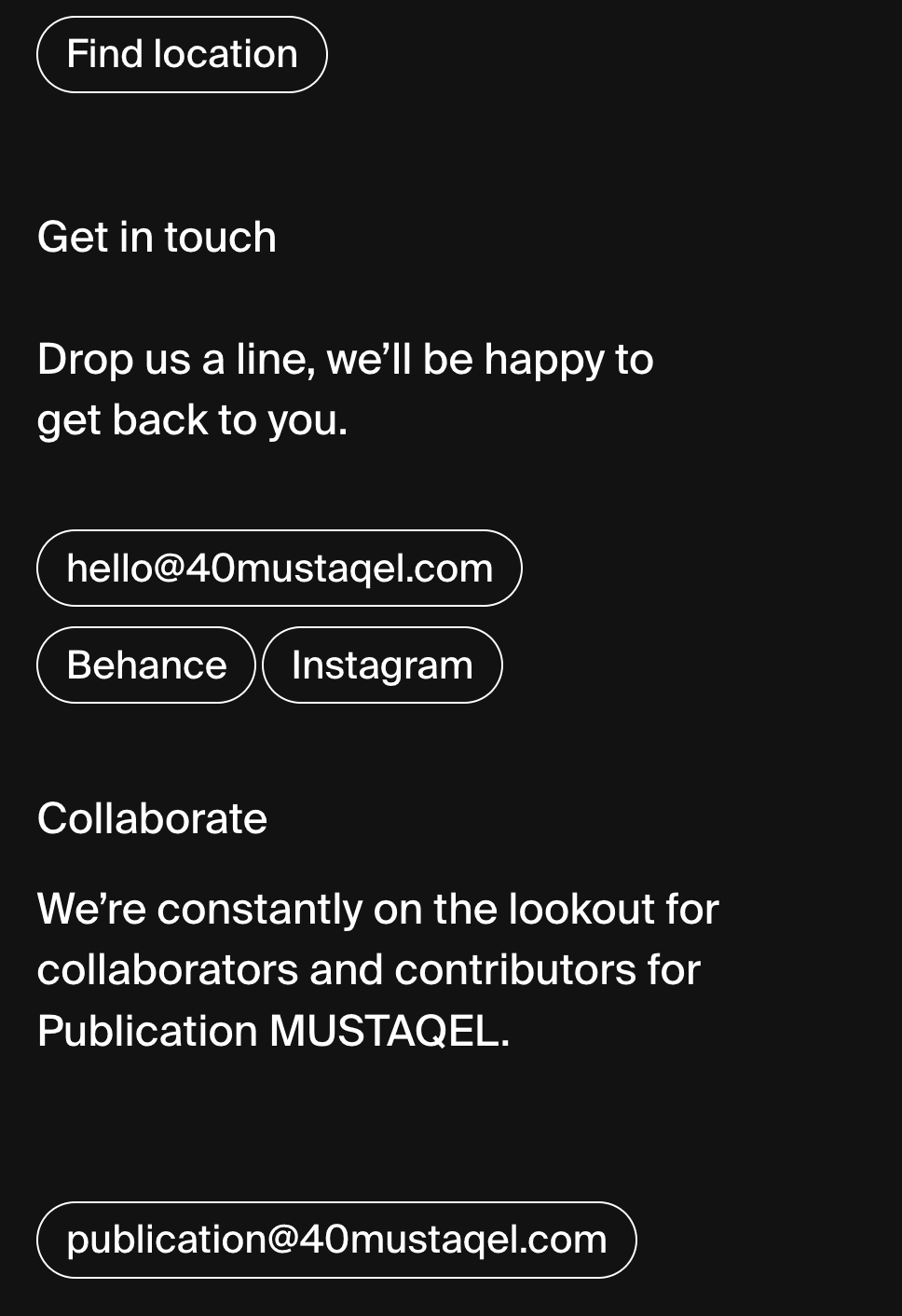
Contact page
I created a custom icon font with their logos to redirect attention in large text spaces.
The webfont allows their icon logo to seamlessly blend in within text paragraphs without interfering with its size or formatting.
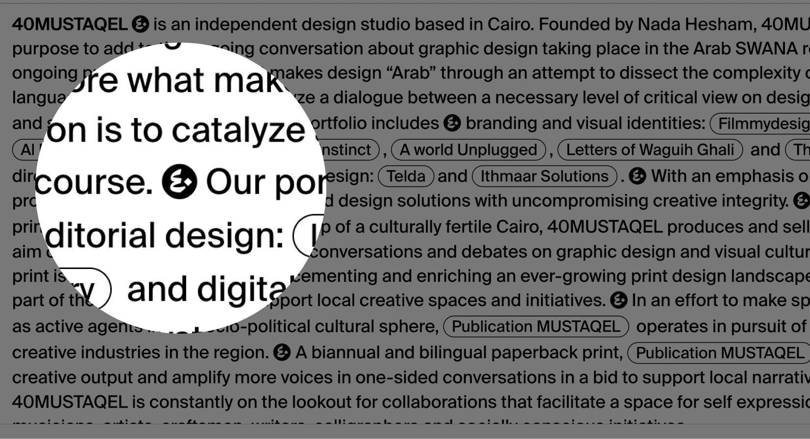
The homepage allows visitors to move the logo around to be able to read the text behind it.
The icon logo was used as a mouse-interactive element pinned towards the bottom of the viewport.
The icon logo responds and rotates according to the moving mouse positions. The motion creates a 360 degree dynamic element to visually contrast against the perfect horizontal placements of other elements on the x and y axes.
The about page creates interactivity with 2-column grids with each scrolling independently
The left side features information about the team, their services, and their clients. While the right side contains a sliding gallery with visuals to put faces to the names.
Project page accordions hide big chunks of text to favour the visuals.
The result was a fully-fledged portfolio website with a sustainable system for easy adding and removing of projects, articles, and shop items.
I gave a small training workshop to teach the team how to use the system I built. I was also around for maintenance and support for the 3 months that followed as they added more projects. After the launch, the website was a great success and was met with many positive reviews from mutual designers.


